OurCreative logo short-hand
OurCreative logo short-handOurCreative logo long-hand
pre-loader

Felight

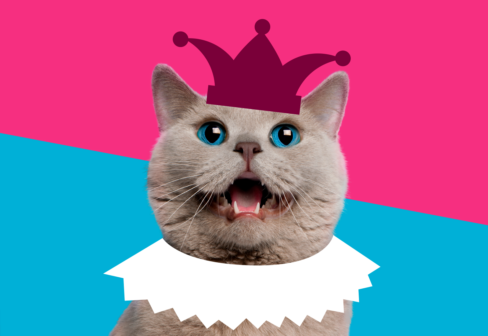
How does One elevate the Royal Wee?

Building on our successful partnership with Pets Choice, the Felight brand approached us in an exciting time for their business. After a successful packaging re-launch across their cat litter and accessories the brand needed a way to solidify Felight in the minds of its customers, increasing brand awareness and causing a disruption in the marketplace.

We saw a huge opportunity to develop a fun, memorable campaign that would not only compliment the bright pink sassiness of the new packaging but would also create a buzz on social media to set the brand nose-and-tail apart from its competitors.

CAMPAIGN DESIGN.
SOCIAL.

OUR RESULTS

22% SALES UPLIFT.

OUR RESULTS

£5MILLION+ IN
INCREASED SALES.

OUR RESULTS

6% SALES UPLIFT.

Before
Before
Before
Before
Before
Before
Before
Before
Before
Before
Dynamic content image from a design case study

ADDING THE SASS.

With a successful existing brand identity and a newly launched packaging design, Felight approached us with the task of making cat litter sassy! Never ones to shy away from a challenge we knew creating a campaign filled with personality that was noticeable, ownable and had legs to be rolled out across multiple channels was what Felight needed to drive brand awareness and create a bang on social to set it apart from it’s competitors in the mind of the consumer.

Before
Dynamic content image from a design case study

Disparate and unloved, Asda's Organic range lacked consistent brand assets with no clear graphical signpost in store or online. It needed a fresh and cohesive new look, that would be instantly recognisable in a busy and saturated

store environment.

SNIFFING OUT THE ISSUES.

We visited store and reviewed the packaging, presenting the following observations:

• The packaging lacked familiar natural cues. The turquoise background and tropical leaves felt appropriate for the human plant-based category.
• The paw graphic was not an ownable asset.
• At shelf, differentiation was a big problem between cat, dog and the different pack formats.
• The packs lacked food appeal, with no emotional connection for pet parents.
• The overpackaged and shiny bags felt artificial and made legibility poor at shelf.

Dynamic content image from a design case study

To really get under the skin of the brand, we immersed ourselves in the competitor landscape, carrying out stakeholder workshops in Germany to find out what makes them unique. We engaged with all departments, from design to supply chain, to discover the brand’s DNA and get everyone behind the new brand strategy.

Loading spinner animation

The Dawat wordmark stands tall and proud, subtly crafted to add an Indian flair. The central and open stance of the ‘W’ kicks off the joyful and optimistic vibe of the identity.

Dynamic content image from a design case study

We created a new identity for Faye, using the shape of speech marks in the logo to represent self-expression and emphasise the self-affirming tone of voice. To represent the audience of the ‘Faye sisterhood’, all photography and illustrations were natural and unedited, a celebration of diversity and individuality.

Dynamic content image from a design case study

ROLLING OUT THE RED CARPET.

To drive relatability throughout the campaign we landed on a royal theme, playing in to the premiss that feline friends are often treated (and act like) kings and queens of the house. By focusing on a positive upbeat personality and re-imagining the litter tray as a throne, we not only played into the royal theme but added a level of humour to create a disruptive presence and encourage share-ability on social media.

Packaging design of mango sorbet lollies
Packaging design of strawberry sorbet lollies

Thanks to our rebrand, Faye now represents and celebrates female confidence, quirks and contradictions… unapologetic and unfiltered.

Dynamic content image from a design case study

By adding ‘Your’ to the brand name, developing a more personal tone-of-voice, and focusing on a human-centric photography style, we created a collection of own-able brand assets that showcase the one-to-one service Your Engine Room provides. To pay homage to the original logo, the cog was pulled into the imagery and the graphics were evolved to become softer and warmer, effectively symbolising Your Engine Room's vision of being an integral part of their clients team.

Dynamic content image from a design case study

The fun tone of voice helps to set the royal tone throughout the campaign. Playing on the sassiness and confidence of the feline personality helps to make the campaign relatable and resonate with cat-owners and cat-lovers alike.

Loading spinner animation
Dynamic content image from a design case study
All videos by Fresh Cut Creative freshcutcreative.co.uk
Loading spinner animation
Packaging design of mango sorbet lollies
Packaging design of strawberry sorbet lollies

PERFECTLY BLENDED.

We created a suite of bespoke illustrations that combine the fluidity of the painted backgrounds with layered collage elements.  The backgrounds evoke liquid infusion, whist the surprising colour combinations of the cut out style botanicals and ingredients add depth, blending traditional and modern aesthetics seamlessly.

Dynamic content image from a design case study

full-on FLAVas.

Our impactful, colourful photography evokes the energy of the brand, bursting with life and vibrancy.

Dynamic content image from a design case study

THE book
OF FAYE.

We designed a comprehensive brand book, so the internal team could immerse themselves in the new world of Faye. Beautifully designed, the layered transparent pages reflect the layering of Faye jewellery, a tactile brand book, it has a premium magazine feel, that audiences will want to engage with and keep.

WHAT’S IN STORE?

Our logo radiates happiness, with the sunshine yellow and roof motif symbolising the joy of home. The “SO” lockup adds a conversational tone to headers, perfect for nifty statements and customer reviews. With thoughtful design at the heart of the brand, our sketch style annotations nod back to Kin’s internal product design team and the care and attention that goes into the creation of every product.

Loading spinner animation
Dynamic content image from a design case study
Loading spinner animation
Dynamic content image from a design case study

HAPPY HOUSEHOLDS.

Asda invested heavily in increasing and diversifying the budget friendly range. It now stretches into every household category from beans to bleach, cat litter and even shampoo, keeping price sensitive households running with all their weekly staples.

Asda invested heavily in gold foil across the whole of the Christmas range to elevate, raising quality perceptions even further.

Dynamic content image from a design case study

CREATING
A KINGDOM.

By designing a suite of assets, sourcing and retouching all imagery and producing an accompanying creative toolkit for ease of rollout, the internal Felight team have all the tools they need to continue to bring the royal vision to life, with flex for new product launches in the future.

Loading spinner animation
Dynamic content image from a design case study

Antenatal & Anti-fluff.

2021 saw the birth of their Expert Antenatal Classes, a modern approach taught exclusively by registered nurses. From the existing brand architecture we developed a suite of assets born from an ultrasound scan, the logo represents both an ‘M’ and the shape of the baby. This is then used as a fluid line acting as a connector between mum-to-be and the antenatal community.

An Italian Classic, mastered in Yorkshire.

A fresh take on an Italian classic, our new Lemon and Orancello designs combine modern, graphical shapes nodding back to the Wolfe Bros branding, paired with a striking raised black gloss varnish giving the bottles a strong bar worthy presence contrasting against our warm, rich colour palette, instantly transporting you to a sun-drenched piazza, spritz in hand!

Dynamic content image from a design case study

A BREATHE
OF FRESH HEIR.

Following a royal unveiling on social, the campaign has launched with a bang, driving brand awareness and encouraging shareability online. We are so excited to continue to build our relationship with both the Felight team and the rest of the cool cats and kittens within the wider Pets Choice brands.

Dynamic content image from a design case study

“THE ENTIRE OURCREATIVE. TEAM HAVE BEEN AN ABSOLUTE JOY TO WORK WITH.

Projects have always been delivered to a high standard, on time and within budget. The quality of their work speaks for itself.”

Chris Socratous, Senior Brand Manager, Pets Choice

Dynamic content image from a design case study

Zest for Life

A suite of flexible bold background colours gives the brand modernity, whilst allowing appropriate differentiation across SKUs and categories.

Dynamic content image from a design case study

OUR RESULTS.

An extension of the My Expert Midwife team, we have an ongoing creative partnership. Our highly targeted approach harmonises across all online, social and paid media.


Recent campaigns include ‘putting the u back into mum’, which we developed to raise awareness to the importance of self-care in motherhood.

Loading spinner animation
Dynamic content image from a design case study
Before
Dynamic content image from a design case study

FUN ALL
YEAR ROUND.

Treats aren’t just for Christmas, the
illustrations, tone of voice and logos
were all adapted to allow the joy
to last all year round.

CREATING A BUZZ.

The new Just Essentials range took the internet by storm, trending across news sites and social media platforms. Celebrated for its timely launch, combatting the cost-of-living crisis and its bold, fresh and distinctive design.

A toolkit was provided for in-house point of sale teams at Asda to create a magical experience in store. Head on down to Asda this Christmas to see our elves work in stores!

We co-created the website with their developers to provide a seamless online experience. Check it out and get your feast in the diary!

RESULTS.

Following our redesign, Webbox naturals has now been relisted nationwide. We’ve even designed new and exciting NPD ranges to the brand and built a broader brand toolkit of assets and illustrations for social media campaigns and marketing materials to fully bring the brand to life off pack. We’re very proud of our PetsChoice partnership, we now work across their brand portfolio and NPD, so keep a look out for more!

We have created a pure and simple identity, with a cohesive suite of brand assets appropriate for different aspects of “Wellness” providing the appropriate flex for future growth.

Launched in late 2020 with the impact of Covid ongoing, UK consumers are still under lockdown restrictions. It’s early days but the range proves to be a success as customers crave a little Wellness and tranquillity at home.

Our new brand identity has energised Little Angels, which continues to go from strength to strength. As well as products and packaging, the design has been rolled out to point-of-sale in-store and on the new Asda Baby Club website, for a full brand experience.

Before
Dynamic content image from a design case study

FUN ALL
YEAR ROUND.

Treats aren’t just for Christmas, the
illustrations, tone of voice and logos
were all adapted to allow the joy
to last all year round.

CREATING A BUZZ.

The new Just Essentials range took the internet by storm, trending across news sites and social media platforms. Celebrated for its timely launch, combatting the cost-of-living crisis and its bold, fresh and distinctive design.

A toolkit was provided for in-house point of sale teams at Asda to create a magical experience in store. Head on down to Asda this Christmas to see our elves work in stores!

We co-created the website with their developers to provide a seamless online experience. Check it out and get your feast in the diary!

RESULTS.

Following our redesign, Webbox naturals is listed in over XX stores, with XX sales uplift. We’ve even designed a Veggie extension to the brand and built a broader brand toolkit of assets and illustration’s for social media campaigns and marketing materials to fully bring the brand to life off pack. We’re very proud of our PetsChoice partnership, and see ourselves as an extension to their fantastic internal team, we now work across their brand portfolio and NPD, so keep a look out for more!

We have created a pure and simple identity, with a cohesive suite of brand assets appropriate for different aspects of “Wellness” providing the appropriate flex for future growth.

Launched in late 2020 with the impact of Covid ongoing, UK consumers are still under lockdown restrictions. It’s early days but the range proves to be a success as customers crave a little Wellness and tranquillity at home.

Our new brand identity has energised Little Angels, which continues to go from strength to strength. As well as products and packaging, the design has been rolled out to point-of-sale in-store and on the new Asda Baby Club website, for a full brand experience.

Loading spinner animation

it’s all sorted.

A modern, optimistic design, putting the joy back into storage. Our thoughtful and friendly brand identity has a suite of flexible assets to shout about the clever product designs in a humble, helpful way, making it easier for the nation to stay neat.

Loading spinner animation
Dynamic content image from a design case study

OUR RESULTS.

A modern, eye-catching and
giftable range that delivers
sacks of personality and

Webbox brand synergy.

OUR RESULTS.

A playful, fun and joyous identity which also reassures parents that Hapello will help their children along their path of discovery and development from baby, pre-school and beyond.

Dynamic content image from a design case study

Back to work.

Dig deeper into this project with
Kim
.
Kim Van Elkan
kim@our-creative.com07900 430870