

26 | Our. Guide to Baby & Family Branding and Packaging
Whether its toys or toiletries, baby and family products demand more than shelf appeal. Parents buy with their heads and hearts, weighing safety, clarity, trust, and value in a matter of seconds. That’s where great brand and packaging design makes a real difference.
Our work with some of the UK’s best-loved baby and family brands has proved time and time again that the right combination of emotional storytelling and practical thinking wins every time. This guide shares how we approach branding in one of the most sensitive and high-pressure categories, where the same rules apply to everyone. So, whether you’re building from scratch, rolling out a refreshed range, or launching into retail for the first time, this is one for you.
What makes great baby & family branding?
Contrary to what you might think, strong branding in this space isn’t just about “looking cute.” It communicates reassurance, builds trust with caregivers, and creates lasting emotional connections.
Trust is everything for new parents, because the stakes are so high. A calm, clear, and consistent visual identity goes a long way in building trust, especially when applied across multiple product types, this is what we did with Little Angels.
Similarly, you have to remember that feelings sell as much as facts (although you can't have one without the other). From the joyful world of Hapello or the reassurance of My Expert Midwife, great baby and family branding connects emotionally and shows up in everything from tone of voice to illustration style to photography choices.
Another key consideration in baby & family is that practicality builds loyalty. Our design work always considers the end user, which could be a sleep-deprived parent scanning shelves or a curious toddler tugging on a toy. Clear labelling, smart pack architecture, and intuitive design earn repeat purchases.
Surprisingly, a lot of brands are still falling short when it comes to gender-neutrality. They forget that it doesn’t have to mean “generic” and that avoiding stereotypes doesn’t mean stripping out personality. For example, with Dynaforce, we created a high-energy identity for older kids that felt inclusive, adventurous, and modern, which is a far cry from the dated ‘blue for boys’ approach.
Last but certainly not least, scalability is key. Most baby and family brands cover a wide range of formats, products, and age stages. That means packaging design assets need to flex without breaking. From nappies to nightlights, a strong core identity brings everything together.
How OurCreative. approaches baby & family branding
We take a whole-brand approach, looking beyond the logo to build systems that are emotionally resonant, commercially effective, and practical to apply.
It starts with strategy, aka understanding your audience, your category, and your opportunity. For Hapello, we knew we needed to speak to both parents and pre-school children, and create a system simple enough for global supplier rollout. That insight shaped everything from the colour palette to the character development.
Another non-negotiable for Our team is building packaging design with real-world application in mind. That includes flexible visual assets that grow with product ranges, and tools that make it easy to stay consistent, especially across multiple teams, suppliers or retail channels.
We also always think beyond the pack. Whether it’s developing tone of voice, planning photography, or bringing your brand to life on Instagram, we help clients show up clearly and cohesively across every touchpoint.
Baby & family brands we’ve helped grow
Little Angels
After six years on shelf, Little Angels needed a design overhaul. We developed a warm, category-spanning brand refresh with parents at its heart, from nappies and food pouches to fashion. The new brand world is calm, cohesive, and easy to navigate, helping parents shop confidently and reinforcing trust in every interaction.

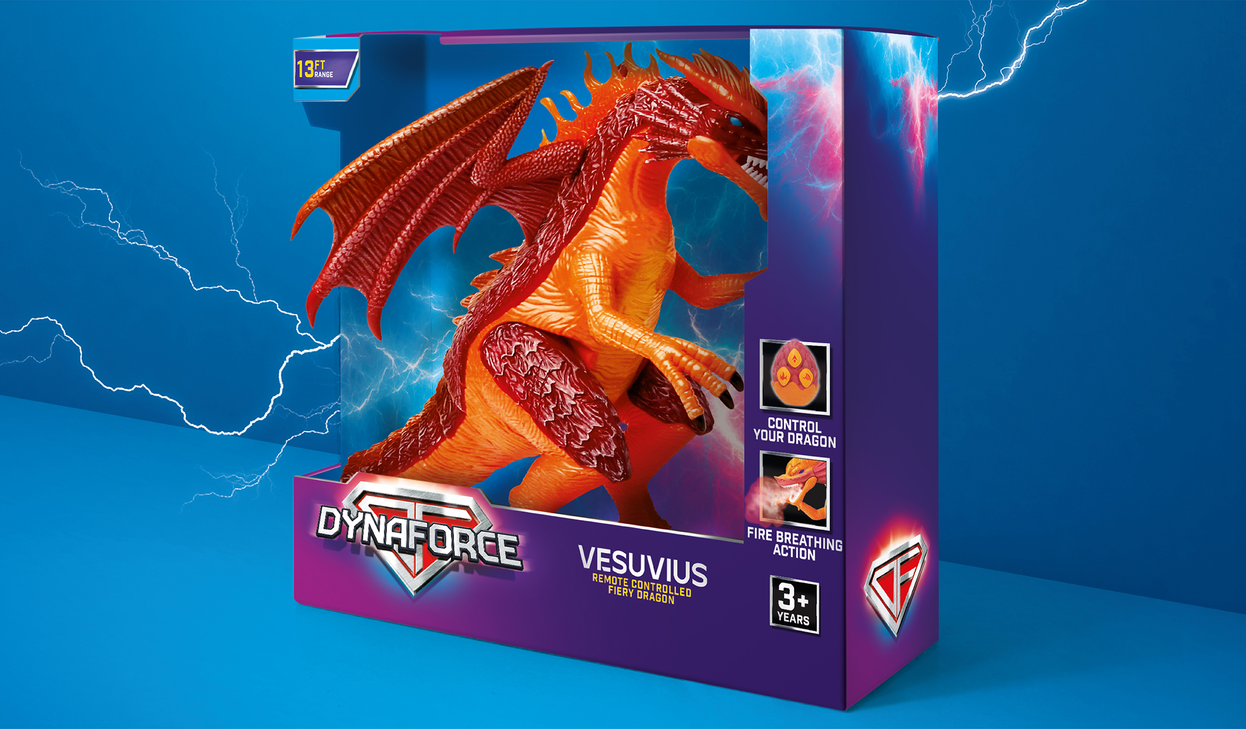
Dynaforce
Built from the ground up, Dynaforce is a homegrown hero for ASDA – a high-impact, action-led toy brand that sidesteps tired clichés. With a confident name, bold visual identity, and inclusive design, it’s proof that retail brands can be both exciting and strategically smart.
My Expert Midwife
From DTC favourite to nationwide retail presence, we’ve been part of My Expert Midwife’s brand journey at every stage. Our evolved identity, sensorial photography and supportive, confident tone of voice helped the brand grow up without losing what made it special.

Hapello
A joyful pre-school toy brand, Hapello brings imagination and trust together in one scalable identity. From building block-inspired graphics to supplier-friendly guidelines, every part of the brand is designed to spark recognition and support seamless rollout across shelves, categories, and continents.

Why the right partner matters
We love working on branding for baby and family because it’s a trust-building exercise, a strategic challenge, and an operational rollout all in one. You need a partner who can balance creativity with commercial understanding, and who knows how to make the whole process easier for your team.
Our team has helped build, evolve and scale some of the most recognisable names in this space, bringing deep category insight, cross-disciplinary expertise, and a proven track record of helping baby and family brands grow with purpose.
Want to create a brand families love and trust? Let’s talk.

Got a brand challenge?
Whether you are looking to define your brand strategy or need a fresh new identity - let’s solve it together!
We know how to create meaningful brands that connect with audiences and pack a punch.
Drop us a note to hello@our-creative.com and we’ll get back to you soon.
Together,

we create belief.
