
Corporate Branding.
What we do:
Brand Identity
Brand Activation
Tone of Voice
Campaign Creation
Expert corporate branding agency.
From data consultancies and leadership experts to manufacturers and marketing teams, we help businesses show up with clarity and confidence. Whether it’s a full rebrand or a refresh that reconnects your people and purpose, we can create brand assets that work hard in a corporate environment and feel human at the same time.
Our approach is authentic, purposeful and strategic. We get under the skin of your business, involve your team in the thinking, and deliver inclusive brands built to inspire from the inside out – from manufacturing site to head office.
If you’re ready for a brand that reflects who you are and where you’re going, let’s start the conversation.

Our clients.
Designs that deliver.
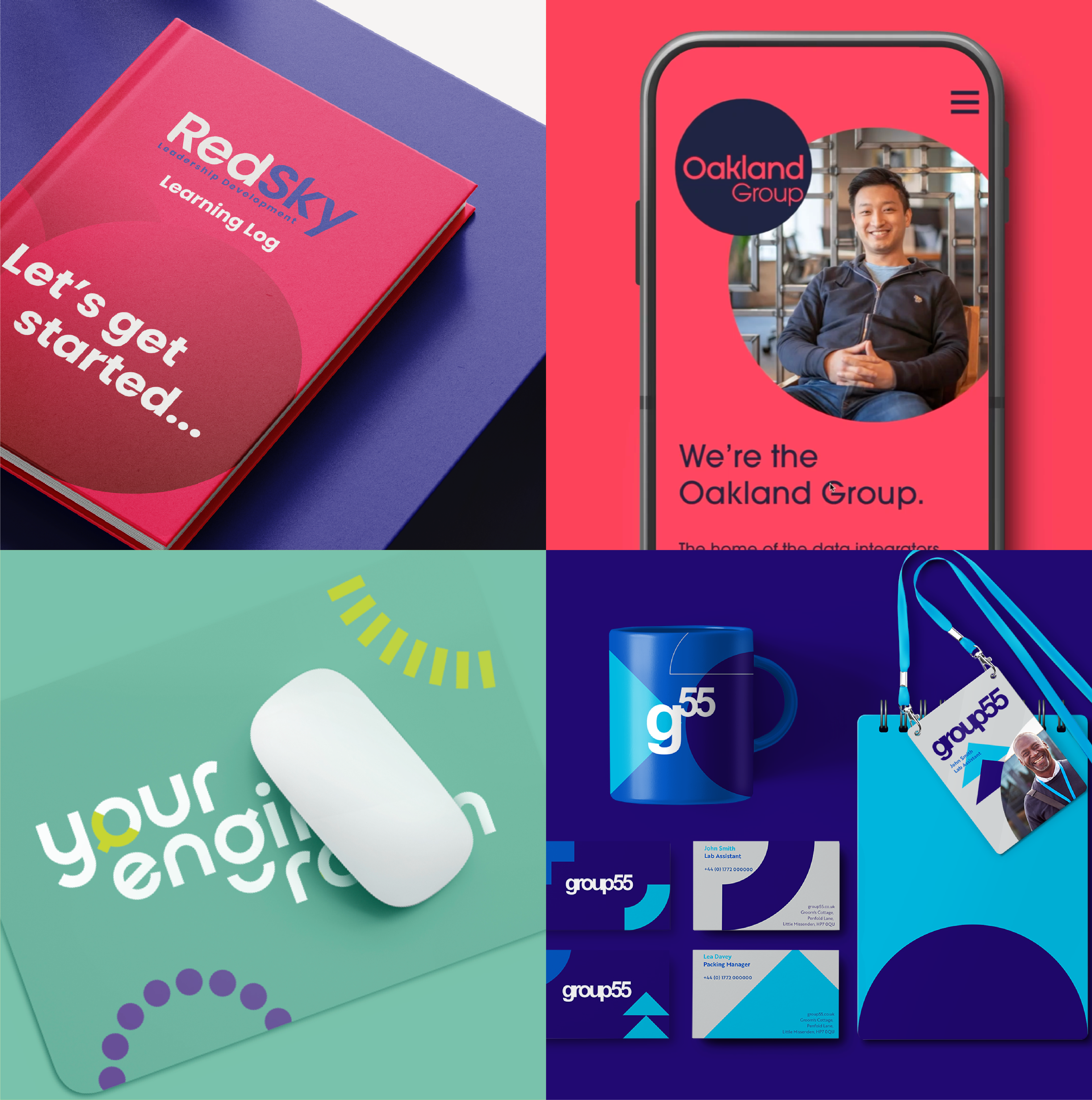
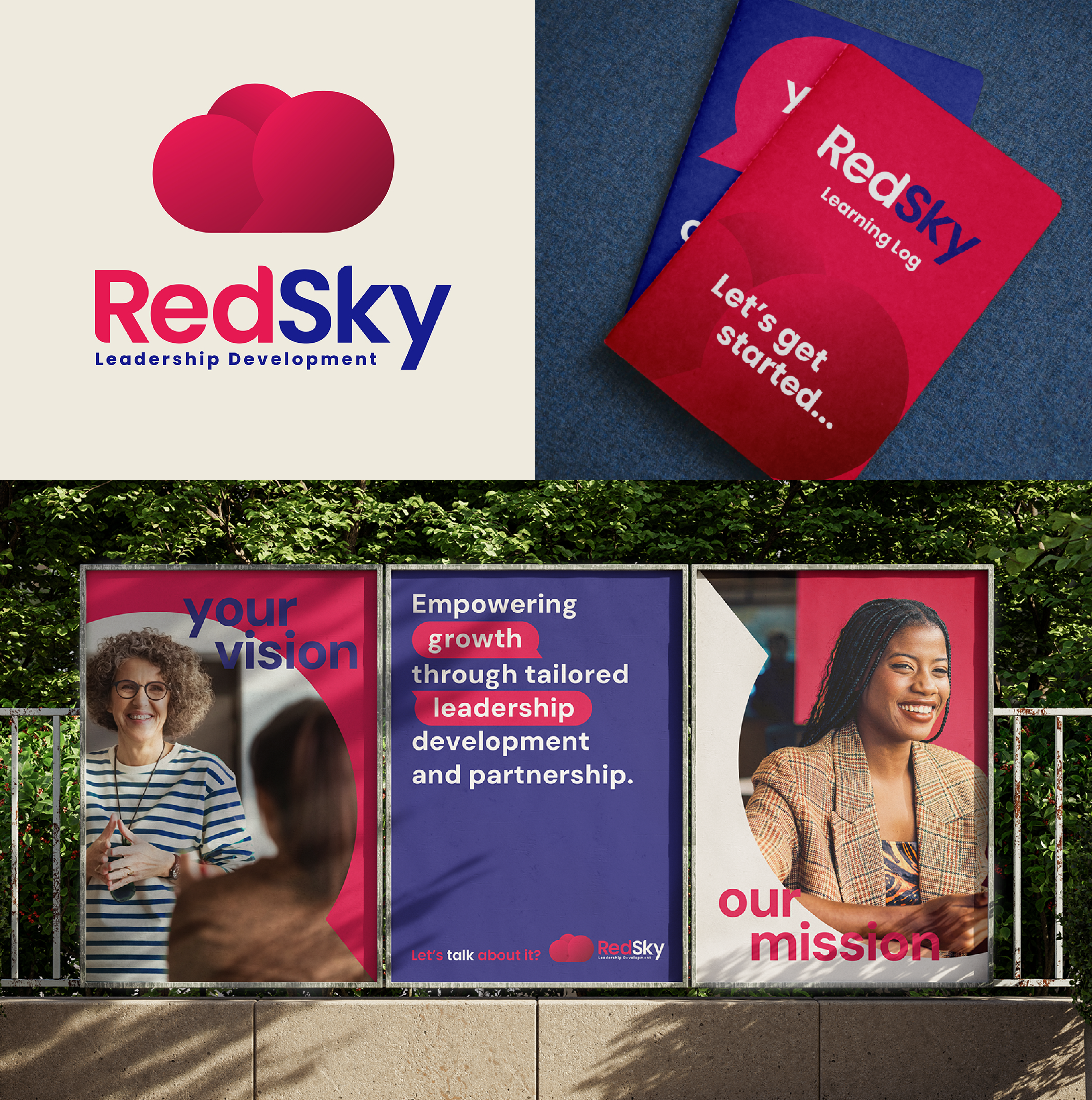
REDSKY
Branding a leadership company that puts women and real experience at the centre.
Challenge.
Red Sky is a leadership development company navigating real barriers in the workplace. Their work is grounded in empathy and lived experience with a specialist lean towards women in the workplace. Their previous identity felt too corporate and too cold, considering the passion of the founders and trainers. They needed an identity that showed they could speak to big business and still connect, human to human.
Idea.
We created a visual and verbal identity that reflected Red Sky’s core strength: clarity with warmth. The tone of voice was direct, emotive, and rooted in understanding. Imagery and colour choices reinforced the personal nature of the work, and we built a flexible system that could adapt across materials, from pitch decks to printed work books. We also considered practical needs like co-branding with client logos and how the identity would show up across their newly redesigned website.
Impact.
Red Sky’s refreshed identity now reflects who they truly are – experienced, energising, and on a mission to make workplaces work better for all. The brand confidently leads with purpose, and opens the door to change.
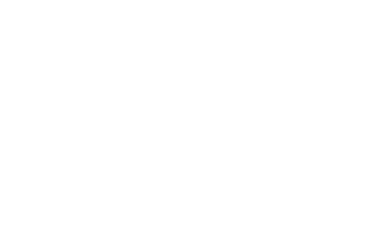
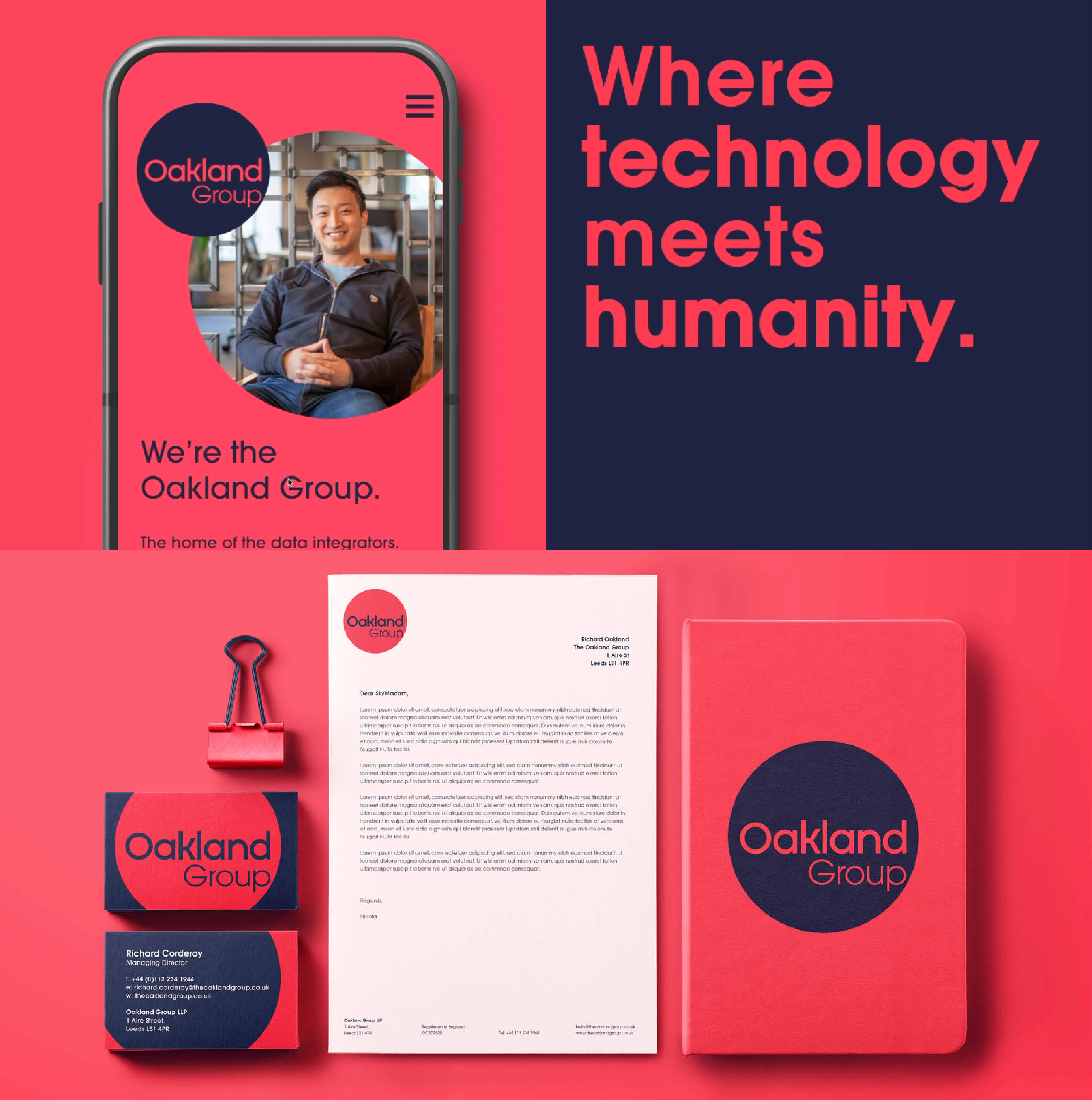
OAKLAND
Giving a high-level data consultancy a brand with clarity, credibility and a human face.
Challenge.
Oakland had been solving complex data problems for over 20 years, competing with giants like Dufrain but offering something those firms couldn’t. Not only did they have deep experience, but also real people who know how to turn data into decisions, but their brand didn’t reflect that. It felt fragmented, faceless, and far too conservative for the modern, approachable team behind it. They needed a refreshed identity that reflected their credibility without losing their warmth.
Idea.
We started by mapping Oakland’s core services and bringing them under one clear, unified brand system. Bold colour, crisp design, and a smart structural system gave each service space to breathe, while real photography of the team reinforced the fact that with Oakland, you get people, not just platforms. We also developed interior design ideas to extend the brand into their newly renovated offices, making the environment feel as sharp and human as the work.
Impact.
The refreshed identity helped Oakland reposition in a crowded market, with a brand that now reflects their level of thinking and real-world expertise. More cohesive, more confident and unmistakably Oakland.
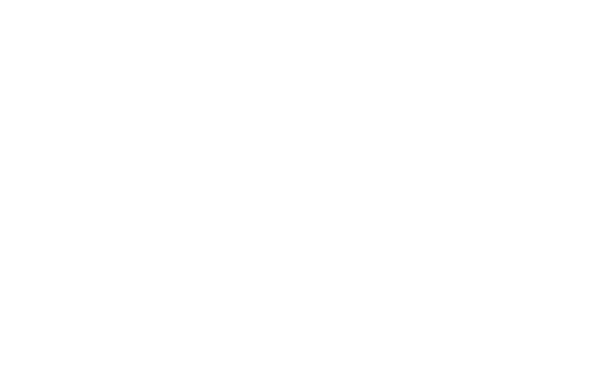
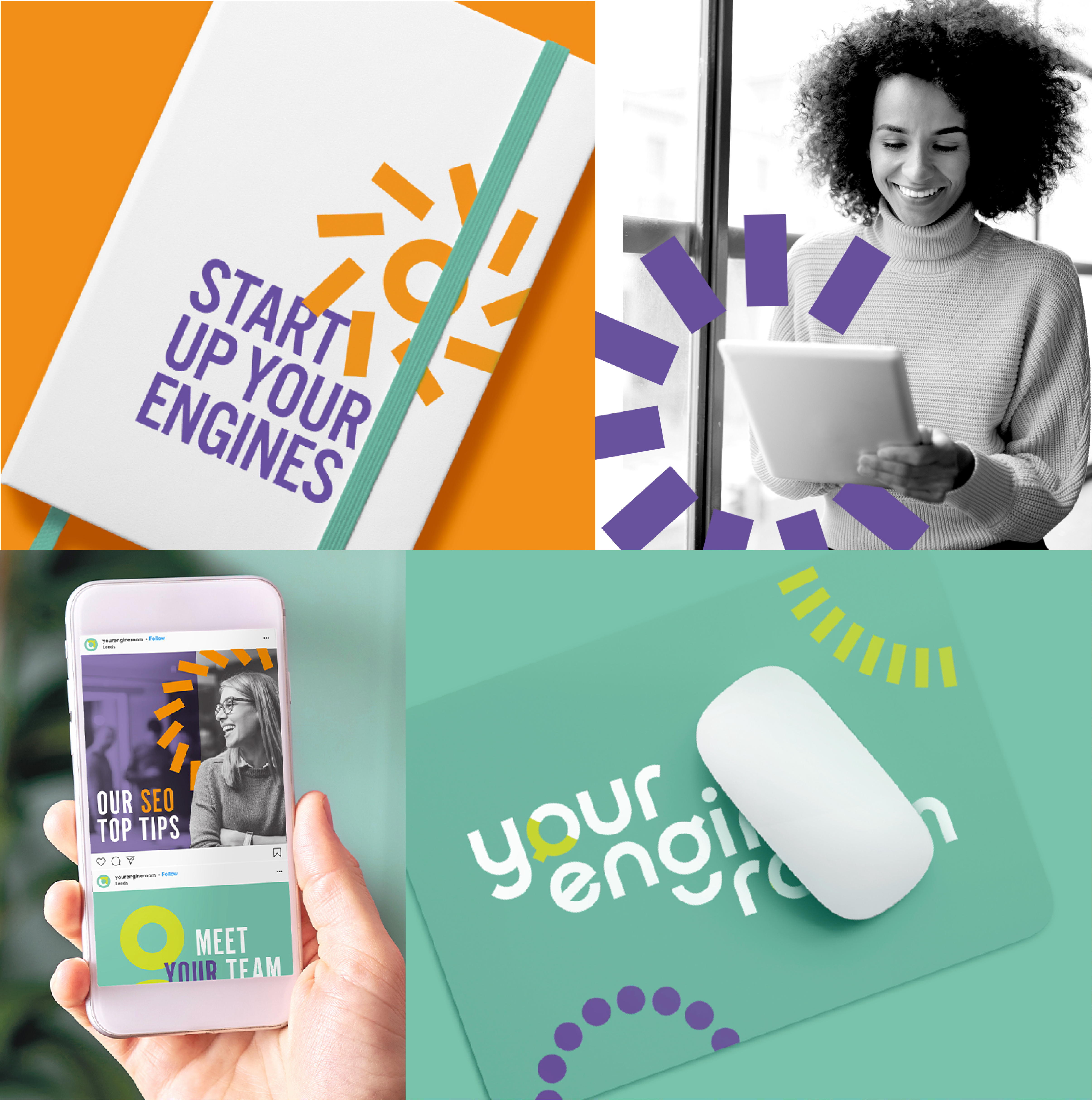
ENGINE ROOM
Helping a plug-in marketing team define what makes them different and make it visible.
Challenge.
Engine Room isn’t your average agency. They’re a team of marketing specialists who plug into B2C businesses that need high-level thinking but don’t have in-house teams. With a brand that didn’t reflect the depth or clarity of what they offer, even their internal team struggled to define their offering. They needed an identity that was simple, confident, and above all, accurate.
Idea.
We began with their brand strategy, bringing the full team into the process to dig into their core values, personality and ultimately succinctly defining their unique point of distinction. . That clarity shaped everything from the brand structure to tone of voice. We built an identity that centres on direct access to experts, underpinned by warmth, intelligence, and no fluff. The system was designed to flex across platforms, while the visuals feel clean, contemporary and precise, just like the work they deliver.
Impact.
The rebrand gave Engine Room so much more than a new look – it gave them alignment. Internally, the team has sharper language and stronger conviction. Externally, clients now see exactly what they’re getting: real people, with real expertise, delivering work that works.
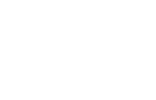
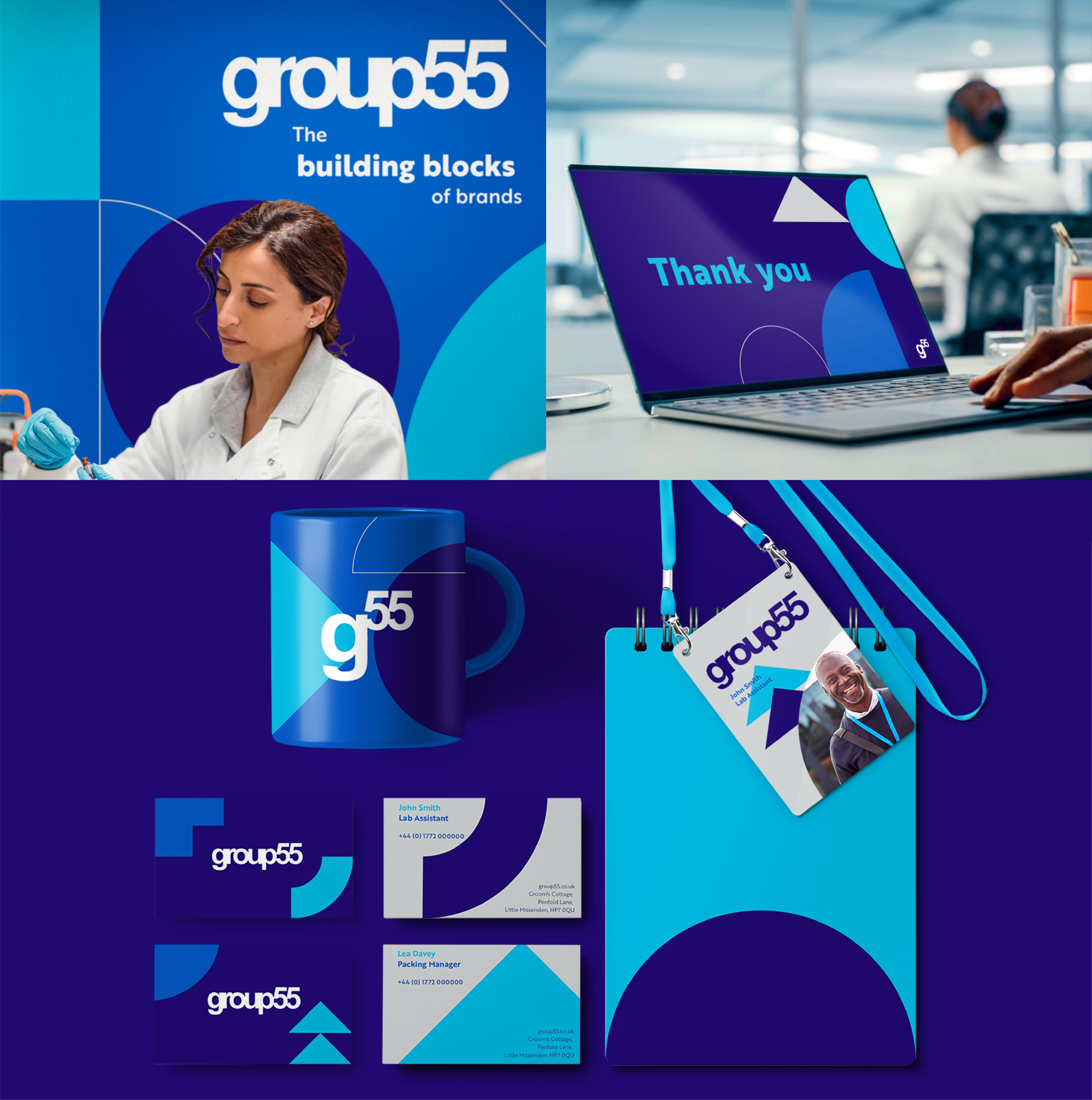
GROUP 55
Creating a unified brand for a UK manufacturer that does it all – and means it.
Challenge.
Group 55 manufacture everything from baby products to tanning mousses and hard surface cleaners, sometimes for household names, sometimes for indie startups. While the business was growing fast, the brand wasn’t keeping up. With multiple sites, no consistent identity, and a disconnect between factory floor and head office, they needed a brand that could unify the business internally and build confidence externally.
Idea.
We started from the inside out. After visiting sites and meeting the team – from lab technicians to leadership – it was clear the brand needed to work across roles, languages and environments. We built a strong, clear identity system with flexibility at its core. Confident, practical, and built to be understood at every level, from sales decks to signage. The new positioning – “The Building Blocks of Your Brand” – captured their role as both expert manufacturer and trusted partner.
Impact.
Group 55 now has a brand that reflects its scale and ambition. The identity has been rolled out across sites and comms, and we’re now working with architects to embed it into their new HQ. It’s a brand built for growth and for the people behind it.
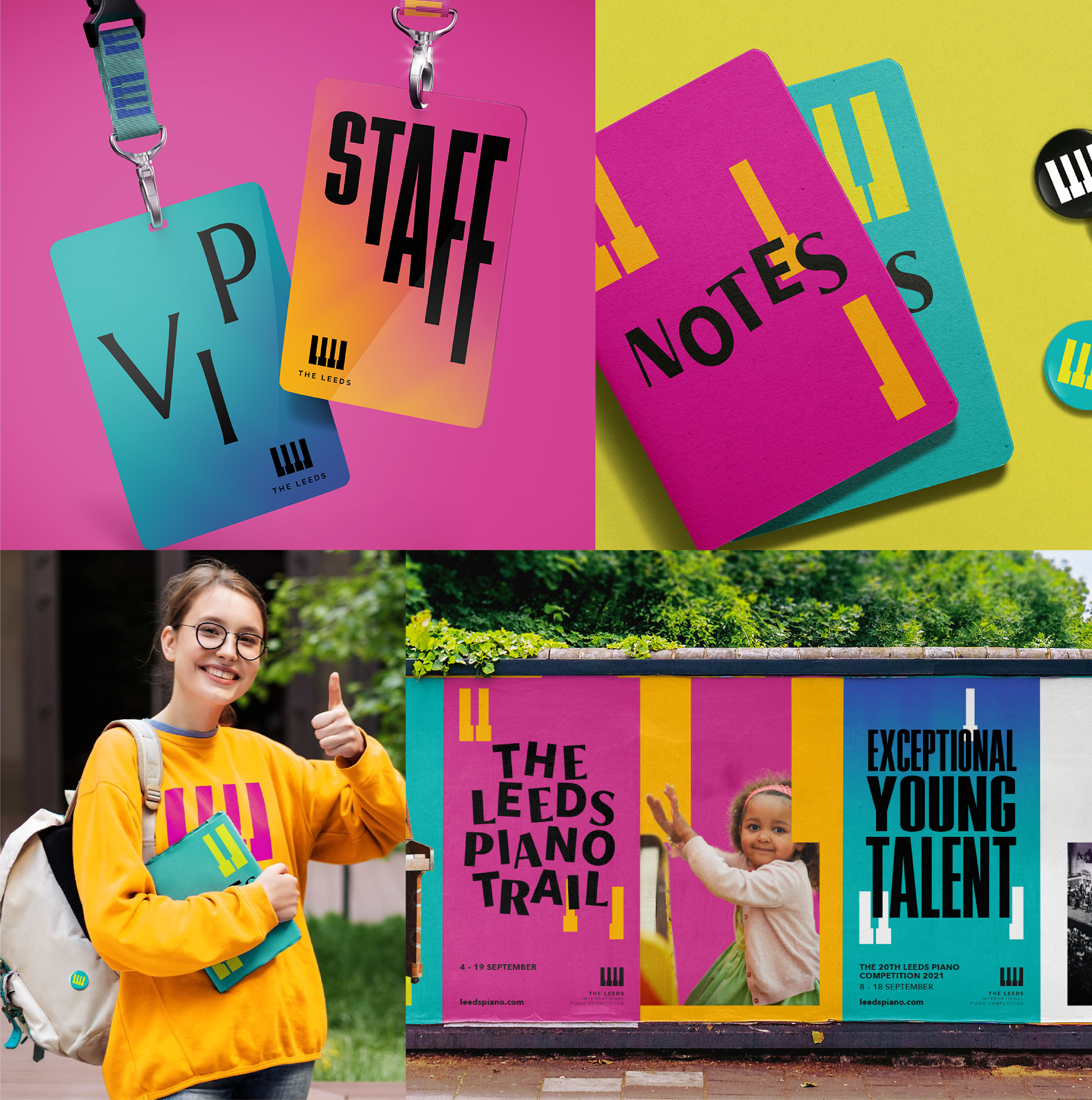
THE LEEDS
Bringing cultural weight and community spirit to the world’s biggest piano competition.
Challenge.
Held every three years in West Yorkshire, The Leeds is a world-renowned piano competition rooted in a single UK city. As it entered a new chapter in 2021, the team needed a refreshed identity that could reflect both sides of the brand: serious musical prestige on one hand, and open community engagement on the other. The logo had to stay, but everything around it needed fresh purpose.
Idea.
We retained the original mark but unlocked its potential through more dynamic applications, evolving the piano key into a flexible system used across quote marks, layout devices and layered visuals. The identity flexed across two moods: a darker, grainier tone for the competition’s intensity, and a brighter, more inclusive palette to reflect its outreach work in schools and community centres across Leeds. The result is a brand that speaks to judges and families, professionals and school children alike.
Impact.
From billboards and banners to a coveted souvenir brochure, the identity ran across every touchpoint and is still being used today. The 2021 competition reached new audiences, brought music into underserved spaces and gave Leeds a moment to be proud of on the world stage.
Got a brand challenge?
Whether you are looking to define your brand strategy or need a fresh new identity - let’s solve it together!
We know how to create meaningful brands that connect with audiences and pack a punch.
Drop us a note to hello@our-creative.com and we’ll get back to you soon.

.gif)

