
PETS AT HOME TOYS
Making small packaging do some serious heavy lifting
Challenge.
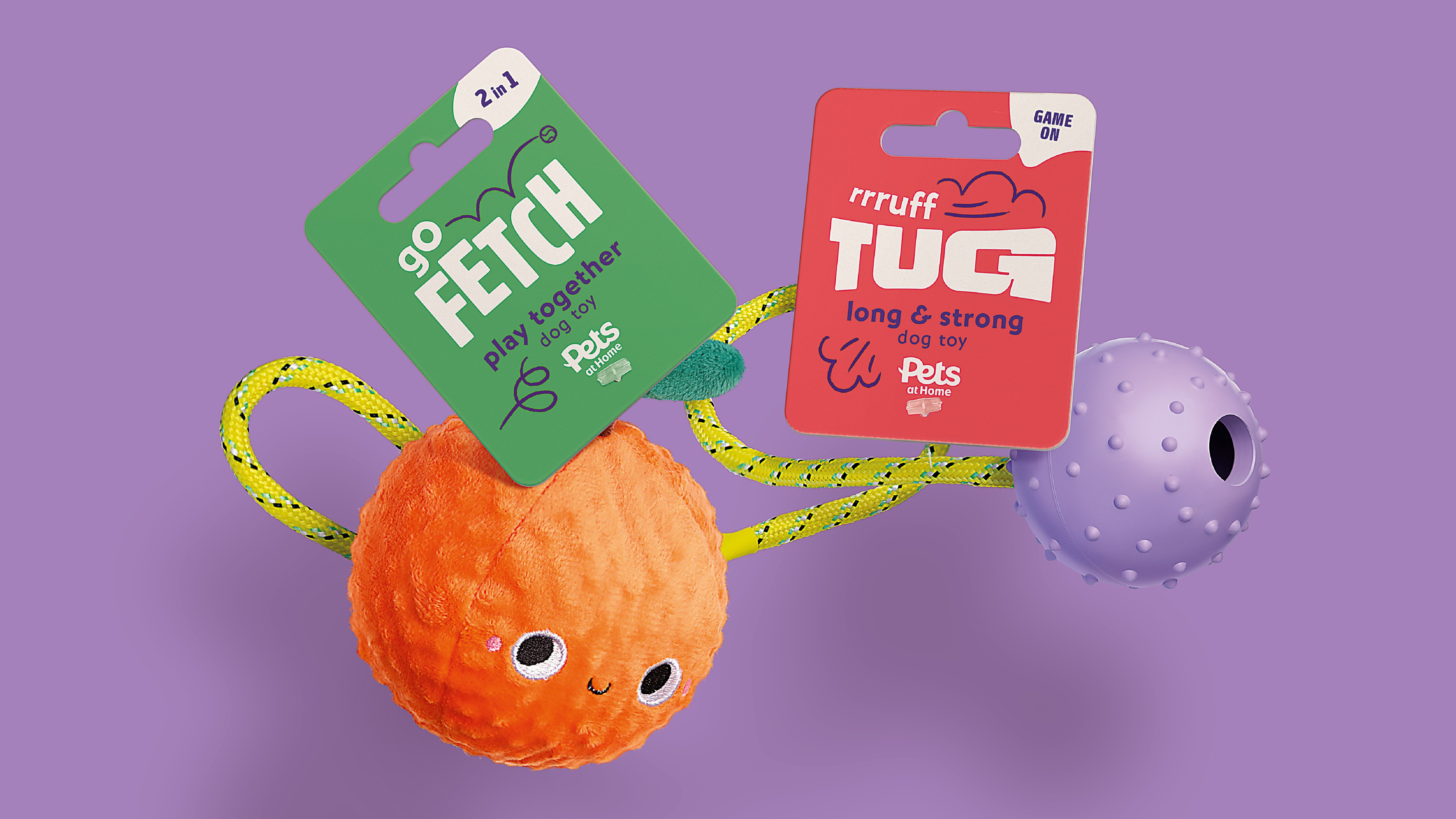
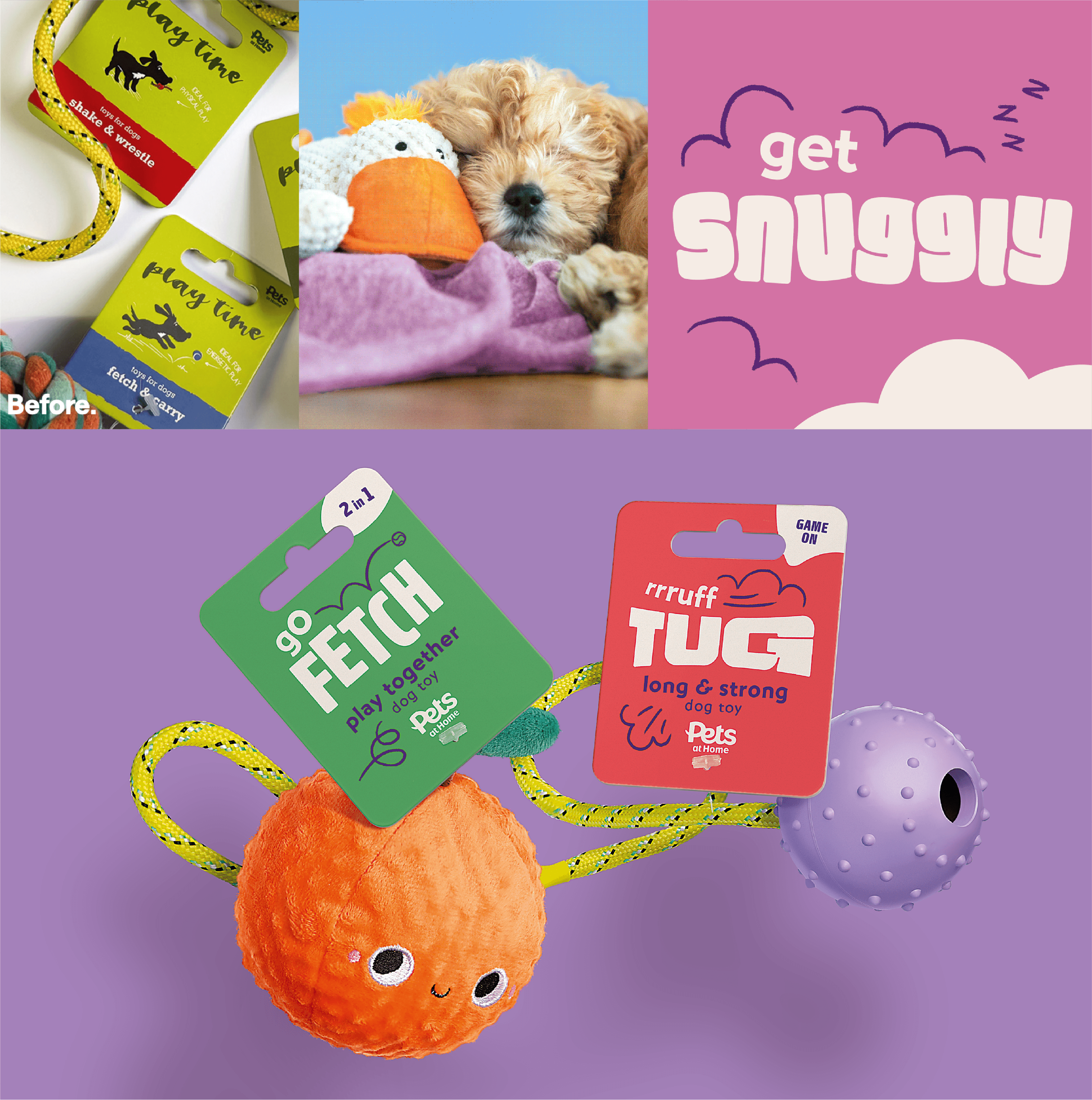
If one thing is true about dog toy packaging, it’s that it should be fun as well as functional. The old tags were looking a little outdated – especially compared to the brand's recently revamped identity – and they didn’t reflect the fun or expertise behind the range. With pressure from Amazon and supermarkets on lower-priced accessories, Pets at Home needed to reinforce their expert status while making the toy aisle simpler and more joyful to shop. The twist for us was the tiny format, as these small swing tags were attached to toys that do a lot of the selling themselves.
Idea.
Our team created a clear, consistent architecture that balances reassurance with personality. A dedicated claims area at the top of each tag makes key benefits instantly visible. Typography flexes to match the toy’s behaviour, whether it's tugging, snuggling, or fetching, injecting fun without cluttering the format. Colour and type choices make it easy to navigate the range at speed, while the puppy sub-range is differentiated subtly through softer tones.
Impact.
Now beginning to land in-store, the new designs bring clarity and cohesion to a previously fragmented range. Even within a small footprint, the packaging communicates expertise, quality and playfulness at a glance. It’s a strong first project in a growing relationship and a live example of how thoughtful architecture can make complex ranges feel simple, shoppable and unmistakably expert.


Got a brand challenge?
Whether you are looking to define your brand strategy or need a fresh new identity - let’s solve it together!
We know how to create meaningful brands that connect with audiences and pack a punch.
Drop us a line to hello@our-creative.com and we’ll get back to you soon.
CREATING LASTING IMPACT... TOGETHER.

