

THE LEEDS
Bringing cultural weight and community spirit to the world’s biggest piano competition.
The Challenge.
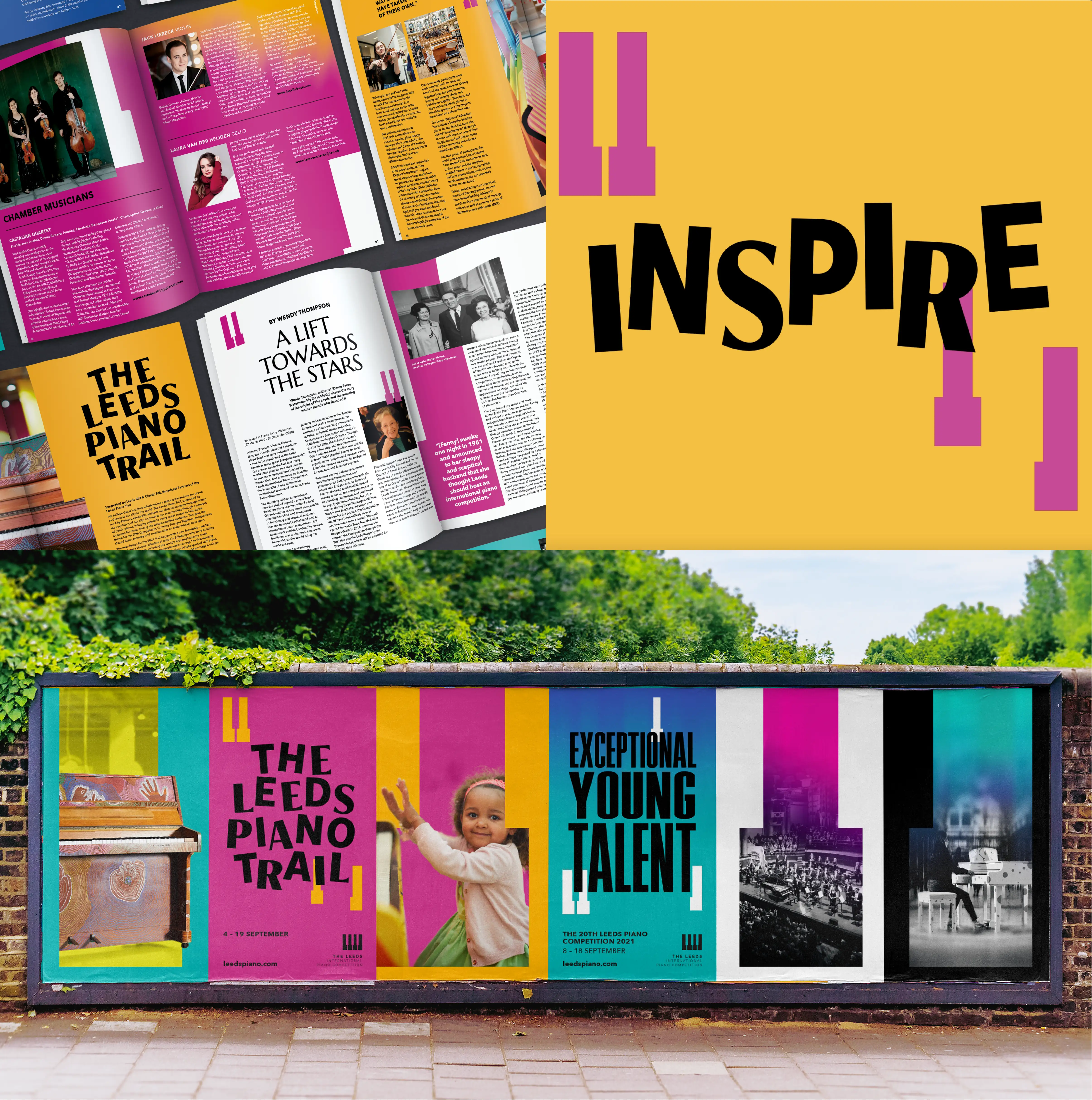
Held every three years in West Yorkshire, The Leeds is a world-renowned piano competition rooted in a single UK city. As it entered a new chapter in 2021, the team needed a refreshed identity that could reflect both sides of the brand: serious musical prestige on one hand, and open community engagement on the other. The logo had to stay, but everything around it needed fresh purpose.
Our Approach
We retained the original mark but unlocked its potential through more dynamic applications, evolving the piano key into a flexible system used across quote marks, layout devices and layered visuals. The identity flexed across two moods: a darker, grainier tone for the competition’s intensity, and a brighter, more inclusive palette to reflect its outreach work in schools and community centres across Leeds. The result is a brand that speaks to judges and families, professionals and schoolchildren alike.
The Impact.
From billboards and banners to a coveted souvenir brochure, the identity ran across every touchpoint and is still being used today. The 2021 competition reached new audiences, brought music into underserved spaces and gave Leeds a moment to be proud of on the world stage.
Want to see some more?
Got a brand challenge?
Whether you are looking to define your brand strategy or need a fresh new identity - let’s solve it together!
We know how to create meaningful brands that connect with audiences and pack a punch.
Drop us a note to hello@our-creative.com and we’ll get back to you soon.
Together,

we create belief.
