BULLFIX
Strong as an ox - A brand built to hold its own – and then some.
The Challenge.
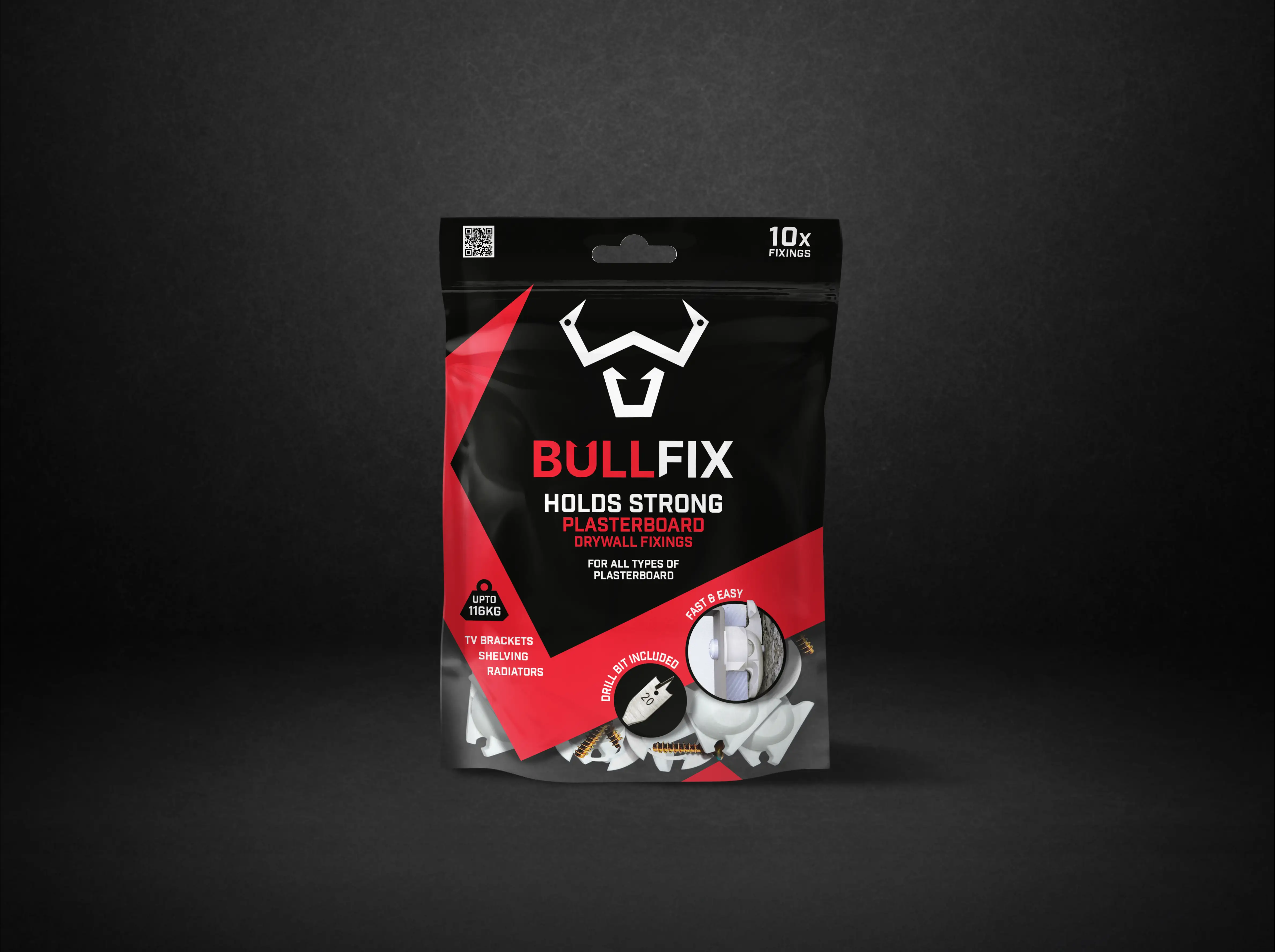
Bullfix had a name with serious punch and a product that really delivered. While the plasterboard fixings were trusted by trade professionals, there was an opportunity to grow into the B2C sector and the packaging didn’t reflect the performance. With small-format packaging, limited shelf real estate and big competitors in its way, Bullfix needed an identity strong enough to muscle into retail and speak directly to both pros and DIYers.
Our Approach.
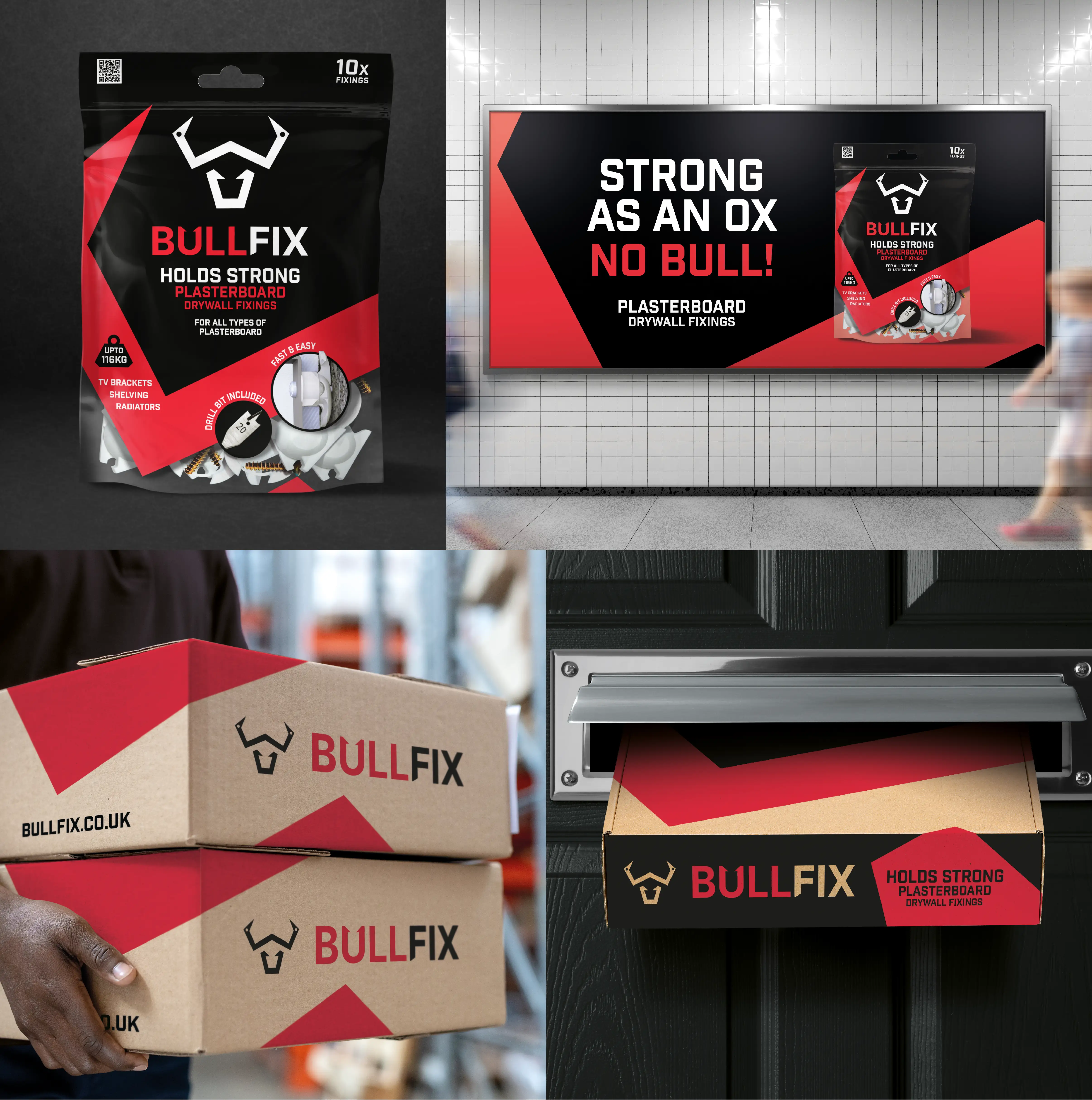
We refined the bull icon and brought it back with more impact, pairing it with a sharp, purpose-built wordmark drawn from the same geometric angles. A prominent black and red palette helped Bullfix stand out in a sea of white and blue, while confident, oversized typography made the most of small pack sizes. From shelf to shipping, we built a unified brand that always looks the part and flexes across retail, trade and online channels.
The Impact.
Now stocked in Screwfix, Bullfix is getting noticed and getting picked up. With growing loyalty from trade and consumer audiences alike, it’s fast becoming the go-to for serious fixings. Proof that good things really do come in small packages.

Want to see some more?
Got a brand challenge?
Whether you are looking to define your brand strategy or need a fresh new identity - let’s solve it together!
We know how to create meaningful brands that connect with audiences and pack a punch.
Drop us a note to hello@our-creative.com and we’ll get back to you soon.


