

ASDA CEREALS
Refreshing a category favourite to stay confident, clear and shelf-ready.
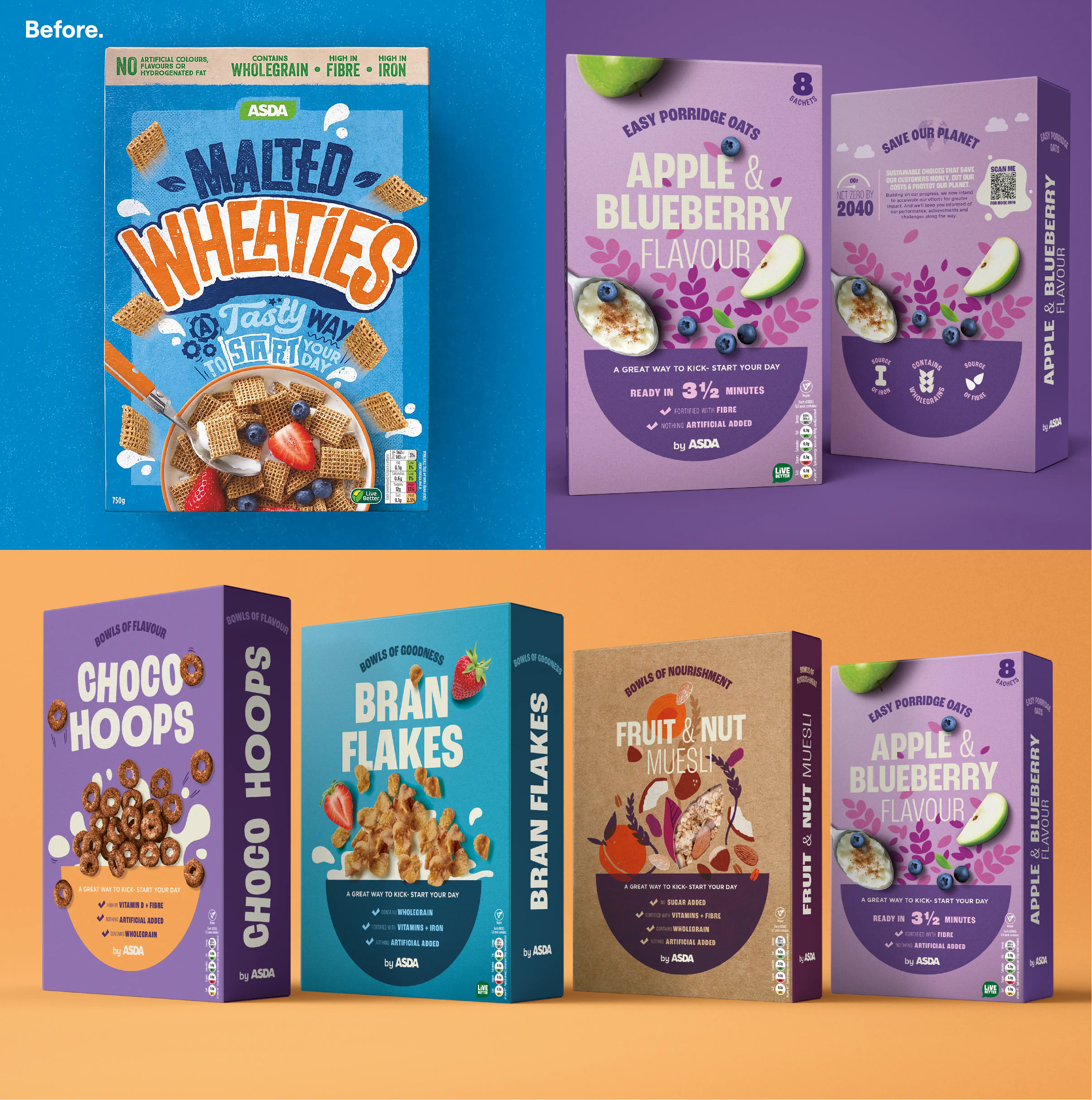
Challenge.
Our previous designs were created 5 years ago, due to new HFSS guidelines, to inject energy into the packs without relying on characters, but design trends and shopper expectations had moved on. We saw that the range now looked cluttered next to stripped-back brand leading competitors and new entrants to the category. ASDA came back to us to refresh the full portfolio once again, keeping the brand loud and proud, but with more modern confidence and simplicity.
Our Approach.
Using our ASDA brand packaging guidelines, we explored how we could push their brand fonts and graphic shapes and feel true to the cereal category. We maintained visual consistency while still leaving space for cereal-specific personality. Each sub-range – from everyday favourites to mueslis and kids cereals – was given room to flex within a unified system. We led the art direction and photography, creating dynamic food shots with milk splashes and bouncy styling that captured movement and energy. Every detail was considered, right down to the back-of-pack – a rare packaging moment where people actually engage with the packaging design.
Our Impact.
The refresh is now live across stores nationwide. The new designs serve as a confident step forward, reflecting ASDA’s category expertise and keeping them visually competitive without losing fun or familiarity. It was a modern update rooted in reality and in a long-standing partnership built on trust and deep category knowledge.
Want to see some more?
Got a brand challenge?
Whether you are looking to define your brand strategy or need a fresh new identity - let’s solve it together!
We know how to create meaningful brands that connect with audiences and pack a punch.
Drop us a note to hello@our-creative.com and we’ll get back to you soon.
Together,

we create belief.
