

JUST ESSENTIALS
Changing the face of value with pride, positivity and shelf standout.
The Challenge.
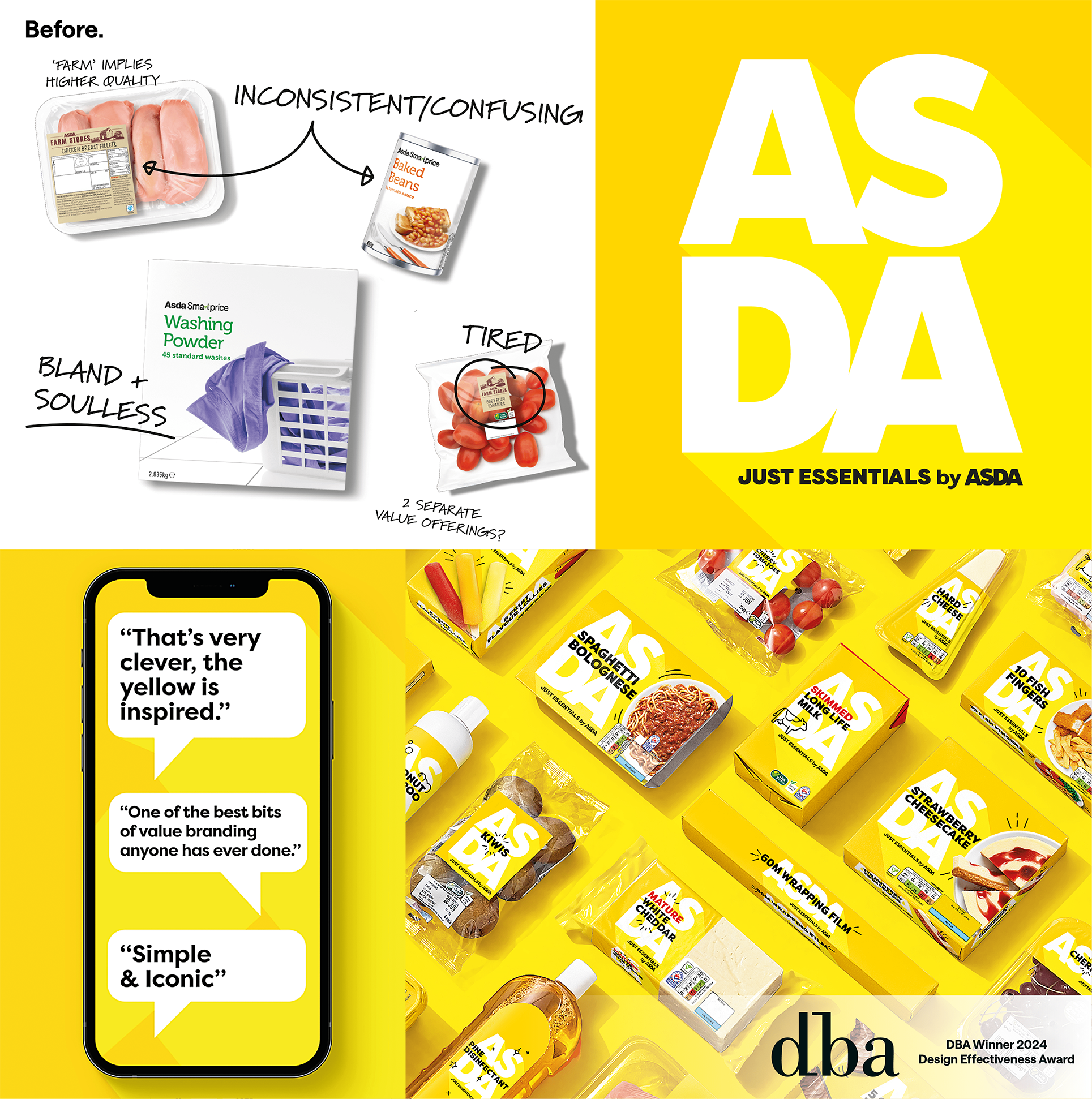
Asda asked us to rethink its Opening Price Point (OPP) range, which took a lot more than a design update. It required us to reframe how value looks and feels and, with that, the challenge was twofold. We needed to differentiate Just Essentials clearly from mid-tier lines, and remove the shame often associated with budget buying – especially during a cost-of-living crisis.
Our Approach.
We built a brand that was proud to show up. Rejecting the usual blank-white minimalism, we created a bold yellow identity that radiates optimism. The ASDA logo was placed prominently on pack in a signal of ownership and confidence. Every decision was made to show that great value doesn’t have to hide.
The Impact.
The launch sparked national conversation and changed behaviour. Penetration rose from 33% to 65%, with purchase limits introduced due to overwhelming demand. A masterclass in design changing perception, without changing the product.
Want to see some more?
Got a brand challenge?
Whether you are looking to define your brand strategy or need a fresh new identity - let’s solve it together!
We know how to create meaningful brands that connect with audiences and pack a punch.
Drop us a line to hello@our-creative.com and we’ll get back to you soon.
CREATING LASTING IMPACT... TOGETHER.

